Off-Balance on Purpose: How Intentional Asymmetry Drives Stronger Visual Design
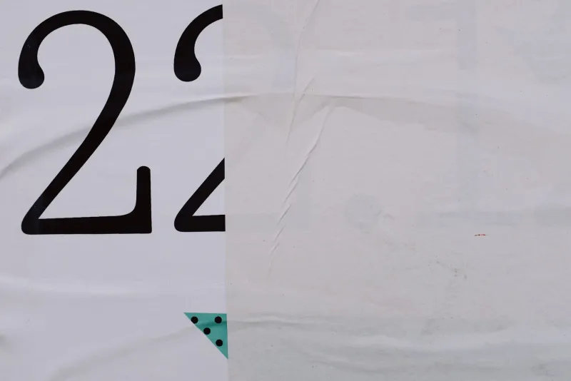
There is a particular comfort in symmetry. It signals order, reliability, and a kind of visual fairness — each side of the frame pulling equal weight, nothing left unresolved. Design education leans heavily on this principle, and for good reason. Balance is foundational. But here is the problem: foundational does not mean optimal. In practice, the compositions that linger in cultural memory are rarely the ones that achieved perfect equilibrium. They are the ones that felt like something was slightly, deliberately off.
At The VME Studio, we spend considerable time studying what separates work that communicates from work that resonates. The distinction, more often than not, comes down to tension — and tension, by definition, requires imbalance.
The Neuroscience of Visual Discomfort
The human visual system is wired to scan for anomalies. When everything in a frame is evenly distributed, the eye has no clear entry point and no particular reason to linger. The brain processes the image efficiently and moves on. But introduce an asymmetrical element — a heavy visual mass on one side, an unexpected void on the other, a subject positioned away from center — and something different happens. The eye is pulled, held, and forced to negotiate the composition rather than simply receive it.
This is not accidental tension. It is engineered discomfort, and skilled designers understand that a viewer who is slightly unsettled is a viewer who is paying attention.
Psychologists refer to this as the Zeigarnik effect in a broader cognitive sense — incomplete or unresolved stimuli demand more mental engagement than those that feel fully settled. A perfectly symmetrical layout resolves itself immediately. An asymmetrical one keeps the viewer's mind working.
Album Covers That Weaponized Imbalance
Few design formats demonstrate this principle as clearly as the album cover, where a single image must communicate an entire artistic identity in roughly four square inches of real estate.
Consider the visual language of hip-hop and indie rock album art over the past two decades. Covers like Kendrick Lamar's To Pimp a Butterfly and Radiohead's Kid A are studies in deliberate compositional instability. In the former, a crowd of figures occupies the lower two-thirds of the frame while an expanse of white sky dominates the upper portion — a distribution that would fail a basic design balance test but succeeds profoundly as a statement of social weight and aspiration. The emptiness above is not wasted space; it is pressure.
In Kid A, the jagged mountain silhouettes are pushed to one side of the horizontal field, leaving a cold, ambiguous glow to fill the rest. The asymmetry mirrors the album's own refusal to resolve into something comfortable. The design does not describe the music — it performs it.
These are not accidents of aesthetic preference. They are strategic decisions to use imbalance as a carrier of meaning.
Film Posters and the Geometry of Unease
Hollywood's marketing machine has, for decades, defaulted to centered compositions — a hero's face, dead center, staring into the camera. It is a formula that communicates confidence and clarity. It is also, increasingly, visually inert.
The film posters that tend to generate genuine cultural conversation operate differently. Saul Bass's iconic work for Vertigo and Anatomy of a Murder placed graphic elements in configurations that actively destabilized the viewer's sense of spatial comfort. The spiraling forms in the Vertigo poster pull the eye inward and downward, creating a sensation of falling that no centered composition could replicate.
More recently, the promotional materials for films like Get Out and Parasite used asymmetrical framing and deliberate visual imbalance to signal psychological unease before a single frame of footage was seen. The design work was doing narrative work — priming audiences for stories that would themselves refuse to settle into familiar patterns.
This is design strategy operating at its highest register: using formal compositional choices to generate an emotional state.
The Rule of Thirds Is a Floor, Not a Ceiling
Design students are typically introduced to the rule of thirds early — divide your frame into a three-by-three grid and position your key elements along the intersecting lines. It is sound guidance. It immediately improves compositions that suffer from static centering, and it introduces a basic form of dynamic balance.
But it is worth understanding what the rule of thirds actually does: it creates managed asymmetry. The subject is off-center, but in a predictable, codified way. For many applications — editorial photography, web layout, print advertising — this is entirely appropriate. The rule of thirds is a reliable tool for producing compositions that feel considered without demanding too much from the viewer.
The more advanced question is what happens when designers move beyond managed asymmetry into something more genuinely disruptive. What happens when the visual weight is distributed in a way that has no established grammar — when the imbalance is not comfortable but is still intentional?
This is where graphic design begins to function more like visual art, and where the most distinctive work tends to emerge.
Tension as a Design Deliverable
The practical challenge for working designers is that clients often conflate balance with professionalism. A composition that feels unsettled can read as unfinished or careless to an untrained eye. The designer's responsibility, then, is not simply to introduce asymmetry but to make the case for it — to demonstrate that the visual tension serves the communication goal.
This requires being able to articulate what the imbalance is doing. Is it creating urgency? Signaling instability within the subject matter? Directing the viewer's attention toward a specific element? Drawing a contrast between two competing ideas? Every asymmetrical choice should have a defensible answer to the question: what is this tension for?
When the answer is clear, asymmetry stops being a design risk and becomes a design advantage. It becomes the thing that makes the work memorable rather than merely competent.
Embracing the Unresolved
Perfect symmetry is, in a certain sense, a finished argument. It states its case completely and leaves nothing for the viewer to do. Asymmetry, by contrast, opens a conversation. It creates a visual proposition that the viewer must engage with, interpret, and in some cases complete in their own imagination.
The most enduring visual work — the album covers, film posters, and graphic design pieces that remain in cultural circulation long after their original context has faded — tends to be work that made this kind of demand. It asked something of its audience rather than simply presenting itself to be admired.
For designers willing to resist the comfort of equilibrium, intentional imbalance is not a problem to be solved. It is a strategy to be deployed — one of the most powerful available.