When Perfect Becomes a Problem: The Emotional Collapse of the Hyper-Polished Image
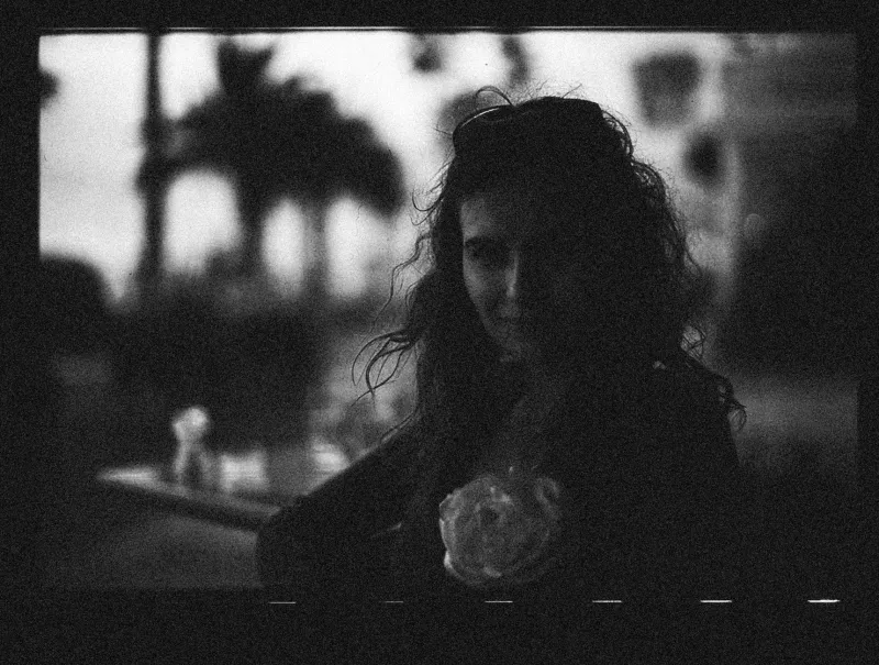
There is a particular kind of photograph that stops you mid-scroll. Not because it is technically exceptional—in fact, quite the opposite. The exposure is slightly uneven. The composition leans into something accidental. A grain pattern interrupts what might otherwise be a seamless surface. And yet, something in it holds. It communicates. It breathes.
Now consider the alternative: a studio-rendered lifestyle image with perfectly corrected skin tones, mathematically balanced negative space, and a color grade pulled from a premium preset pack. Every element is in its proper place. It is, by most measurable standards, the superior image. And yet it slides past your attention without leaving a mark.
This is the central paradox confronting visual media in 2025. The tools that were once reserved for high-budget production houses—color grading software, AI-assisted retouching, cinematic filter stacks—are now available to virtually anyone with a smartphone and a subscription. The result is not a golden age of visual quality. It is something far more complicated: a saturation point at which technical perfection has become the baseline, and the baseline has become invisible.
The Democratization Paradox
When Lightroom presets began flooding the consumer market in the early 2010s, the promise was democratization. Independent photographers, small business owners, and content creators could now produce work that approximated the look of major editorial shoots. That promise, in narrow technical terms, was largely fulfilled.
But democratization carries an unintended consequence. When a visual language becomes universally accessible, it also becomes universally diluted. The moody teal-and-orange grade that once signaled cinematic craftsmanship now appears on food delivery app advertisements and mid-tier Instagram accounts in equal measure. The effect has been a kind of aesthetic inflation—where the currency of polish has lost much of its purchasing power.
Audiences, even those who cannot articulate why, have internalized this shift. Eye-tracking studies and engagement analytics across major US platforms consistently show declining interaction rates with content that reads as overly produced. Viewers have developed what might be called a glossiness threshold—a subconscious ceiling above which visual refinement begins to register as artificiality rather than quality.
What the Brain Reads as Real
The psychological dimension of this phenomenon deserves serious attention from anyone working in visual media. Human perception is calibrated, in part, by imperfection. We are wired to read micro-inconsistencies—slight variations in lighting, the organic roughness of an unretouched texture, the minor instabilities of a handheld frame—as evidence of authenticity. These signals tell the brain that what it is seeing corresponds to something that actually occurred in the world.
Hyper-polished visuals, by contrast, trigger a different cognitive response. When every element is optimized, when no surface retains its original character, the image begins to read as constructed rather than witnessed. This is the visual equivalent of the uncanny valley—a term borrowed from robotics to describe the discomfort that arises when something appears almost human but not quite. The closer a synthetic image gets to perfect realism, the more unsettling it becomes. The same principle applies to overproduced photography and video: the closer it gets to a frictionless ideal, the more the audience senses that something genuine has been removed.
The Strategic Turn Toward Texture
Forward-thinking studios and brand creative directors across the US have begun responding to this dynamic with deliberate intention. The shift is visible across multiple sectors. Independent film productions are reintroducing film grain not as a stylistic affectation but as an emotional signal. Direct-to-consumer brands are commissioning photography that preserves natural skin texture, uncontrolled ambient light, and the slight awkwardness of unstaged moments. Editorial design teams are selecting typefaces with visible irregularities and layouts that resist the clean grid.
This is not nostalgia, though it is sometimes misread as such. It is a strategic recalibration—a recognition that restraint and rawness, when deployed with intention, carry greater communicative weight than any amount of technical refinement. The goal is not to appear amateur. It is to appear honest.
The distinction matters enormously. There is a significant difference between an image that is rough because its creator lacked the resources to refine it, and an image that is rough because its creator understood that refinement would cost it something essential. The former is a limitation. The latter is a choice—and audiences, on some level, can tell the difference.
Restraint as a Competitive Advantage
For studios and independent creators operating in a crowded media environment, this represents a genuine strategic opportunity. In a landscape where every competitor has access to the same tools, the same presets, and the same AI-assisted workflows, the decision to step back from maximum polish is itself a differentiator.
Consider the visual identity of some of the most culturally resonant American brands of the past decade. Many have moved away from the aspirational gloss that defined early-2000s advertising toward something more grounded—imagery that acknowledges imperfection, that shows process alongside product, that allows the viewer to sense a human hand somewhere in the chain of creation. This is not accidental. It reflects a sophisticated understanding of how audiences have evolved.
For filmmakers and photographers, the implication is equally clear. The craft is no longer primarily about achieving technical perfection—software has largely solved that problem. The craft is now about knowing when to withhold perfection, and why. It is about developing the editorial judgment to recognize which imperfections carry meaning and which are simply noise.
The Role of Intentionality
None of this is an argument against technical skill. Quite the contrary. It takes a high level of competence to deploy rawness with precision—to introduce grain at the right density, to allow a shadow to fall in a way that feels accidental but is entirely controlled, to edit a sequence so that its pacing feels spontaneous rather than calculated. The aesthetic of authenticity, when executed well, is among the most demanding disciplines in visual media.
What is being challenged is not the value of craft but the conflation of craft with polish. For much of the past two decades, the visual media industry has operated on an implicit assumption that more refinement equals more quality. That assumption is now under serious pressure.
The creators who will define the next era of visual media are those who understand polish as one tool among many—not the destination, but occasionally the obstacle. They will know when a technically imperfect image is the right image. They will understand that what an audience feels is always more important than what they can objectively measure. And they will have the confidence to resist the default toward perfection when something more truthful is available.
In a media environment saturated with the flawless, the deliberate flaw may be the most powerful statement a creator can make.