Directed by Design: How Visual Pathways Turn Passive Viewers into Active Participants
There is a quiet argument happening inside every well-constructed image. Lines compete for dominance. Colors negotiate proximity. Shapes either collaborate or collide. Most viewers never consciously register this negotiation — they simply feel its outcome. They linger on a photograph longer than expected, absorb a poster's message almost instantly, or find themselves emotionally moved by a film frame they couldn't fully explain. That experience is not accidental. It is engineered.
At The VME Studio, we operate from a foundational belief: visual media elevated to its highest form is not merely beautiful — it is purposeful. And nowhere is that purposefulness more apparent than in the strategic use of leading lines and visual hierarchy, the twin mechanisms through which great designers, photographers, and cinematographers convert passive observation into genuine engagement.
The Eye Does Not Wander — It Follows
Human vision is not random. Decades of perceptual psychology research, including foundational studies from institutions like MIT's Department of Brain and Cognitive Sciences, confirm that the eye moves through a visual field according to predictable patterns. Strong contrast pulls attention first. After that initial anchor, the eye seeks a path — a route through the composition that feels natural, almost inevitable.
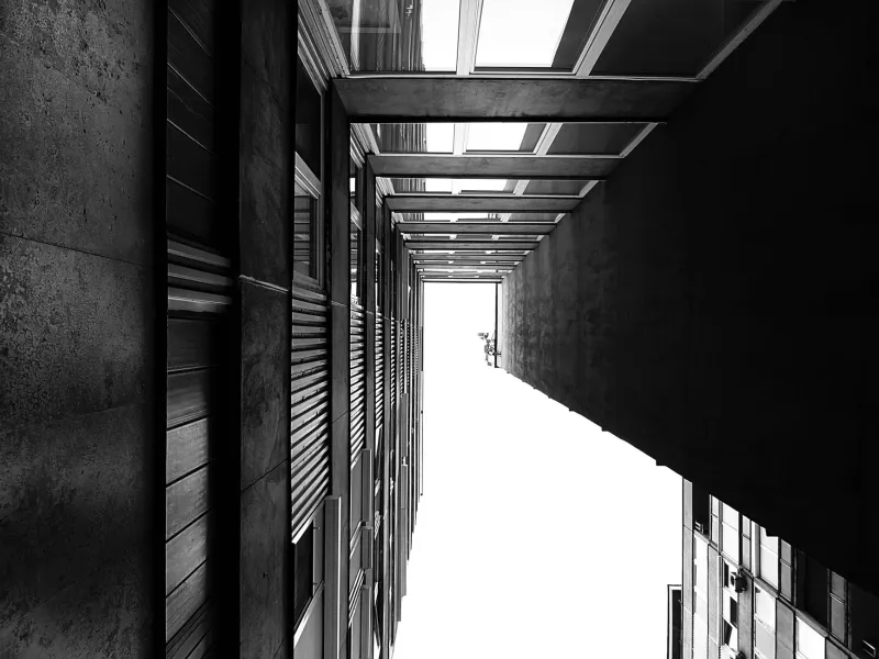
Leading lines are the most direct tool for creating that route. In their most literal form, they are exactly what the name suggests: physical lines within the frame — a road receding toward a horizon, a staircase spiraling upward, the diagonal edge of an architectural structure — that guide the viewer's gaze toward a specific destination. But in their more sophisticated applications, leading lines are rarely so obvious. They emerge from the alignment of implied edges, the repetition of shapes across a layout, or the subtle directional cues embedded in a subject's body language or gaze.
Consider the classic example of Ansel Adams' landscape photography. The sweeping curves of a valley floor or the angular descent of a mountain ridge are not merely geographic features captured on film — they are compositional instruments, drawing the eye from the foreground into the vast depth of the frame. Adams understood intuitively what contemporary design science has since confirmed: the eye treats implied movement as an invitation.
Hierarchy Before Harmony
Visual harmony is a worthy goal, but it is subordinate to hierarchy. A composition can be beautifully balanced and utterly forgettable if it fails to establish a clear order of importance. The most resonant design work — whether a magazine spread, a brand identity system, or a cinematic wide shot — always answers the same foundational question first: What do I want the viewer to see, and in what sequence?
This question is the engine of visual hierarchy. It demands that creators make deliberate decisions about scale, contrast, positioning, and color weight before any aesthetic choices are finalized. A headline set in a large, high-contrast typeface at the top of a page is not simply a stylistic preference — it is a declaration of reading order. A brightly lit subject placed at the intersection of compositional thirds is not coincidence — it is a calculated signal.
In graphic design, this hierarchy is often expressed through typographic systems. Studios working on identity and editorial projects regularly construct what designers call a "reading architecture" — a layered structure of primary, secondary, and tertiary visual elements that the viewer navigates in a predetermined sequence. The goal is never to restrict the viewer's experience, but to orchestrate it.
Film as the Purest Laboratory
If still imagery demonstrates the principles of visual flow, cinema stress-tests them in real time. A film frame must not only establish hierarchy within a single composition — it must sustain and evolve that hierarchy across cuts, camera movements, and shifting narrative contexts.
Stanley Kubrick's work remains among the most studied examples of deliberate visual architecture in American cinema. His use of one-point perspective — particularly in films like The Shining and Full Metal Jacket — creates an almost aggressive leading line, a corridor of space that pulls the viewer's eye toward a single vanishing point with uncomfortable precision. The effect is not merely aesthetic. It generates psychological tension, a sense of inescapable direction that mirrors the thematic content of each story. The visual pathway becomes the narrative argument.
Contemporary cinematographers working in independent film have absorbed these lessons and adapted them for smaller-scale productions. Rather than relying on elaborate set construction, many now use natural architectural elements — doorways, window frames, urban geometry — as compositional scaffolding. The leading lines are borrowed from the environment rather than built from scratch, but the strategic intention remains identical.
The Invisible Architecture of Advertising
Perhaps no commercial discipline has more rigorously applied visual flow principles than advertising design. A print advertisement or digital banner has, on average, less than two seconds to capture attention and deliver a message. In that compressed window, every compositional decision is load-bearing.
The most effective advertising layouts consistently employ what practitioners call a "Z-pattern" or "F-pattern" flow — structural arrangements that align key information with the eye's natural scanning behavior across a page or screen. The entry point (typically the upper left in left-to-right reading cultures), the primary visual anchor, the supporting message, and the call to action are positioned along these natural scanning routes with surgical precision.
What separates merely functional advertising from genuinely memorable work, however, is the willingness to subvert these patterns with intention. A layout that deliberately interrupts the expected flow — placing a bold visual element where the eye anticipates negative space, or using a diagonal line to cut across the grid — creates a moment of productive disruption. The viewer's attention is not just captured; it is heightened by the surprise.
Designing the Journey, Not Just the Destination
The deepest insight embedded in visual flow theory is this: the most powerful design work does not simply present something to be seen — it creates an experience of seeing. The distinction matters enormously.
When a creator thinks only about the final message or the hero image, they are designing a destination. When they think about leading lines, visual hierarchy, and the sequence in which information is revealed, they are designing a journey. And journeys, by their nature, are more memorable than destinations. They involve the viewer. They create a sense of discovery, even when that discovery is entirely staged.
This is the elevated standard to which serious visual media practitioners hold their work. Not merely: does this look compelling? But rather: does this move the viewer — literally, through the composition, and figuratively, in their emotional response to it?
At its core, that is the promise of intentional design strategy. Not decoration. Not ornamentation. Architecture — built not from steel and concrete, but from light, line, and the extraordinary complexity of human attention.
The forgettable image asks to be noticed. The unforgettable one leads you somewhere you didn't know you wanted to go.